The purpose of this workshop was to create a character as the face of a brand of cereal made up by us. We had to base our designs on who this would appeal to and why it would be appealing. It was also to demonstrate the stages in designing a character for a brand, from initial rough sketches to finalized versions in Illustrator.
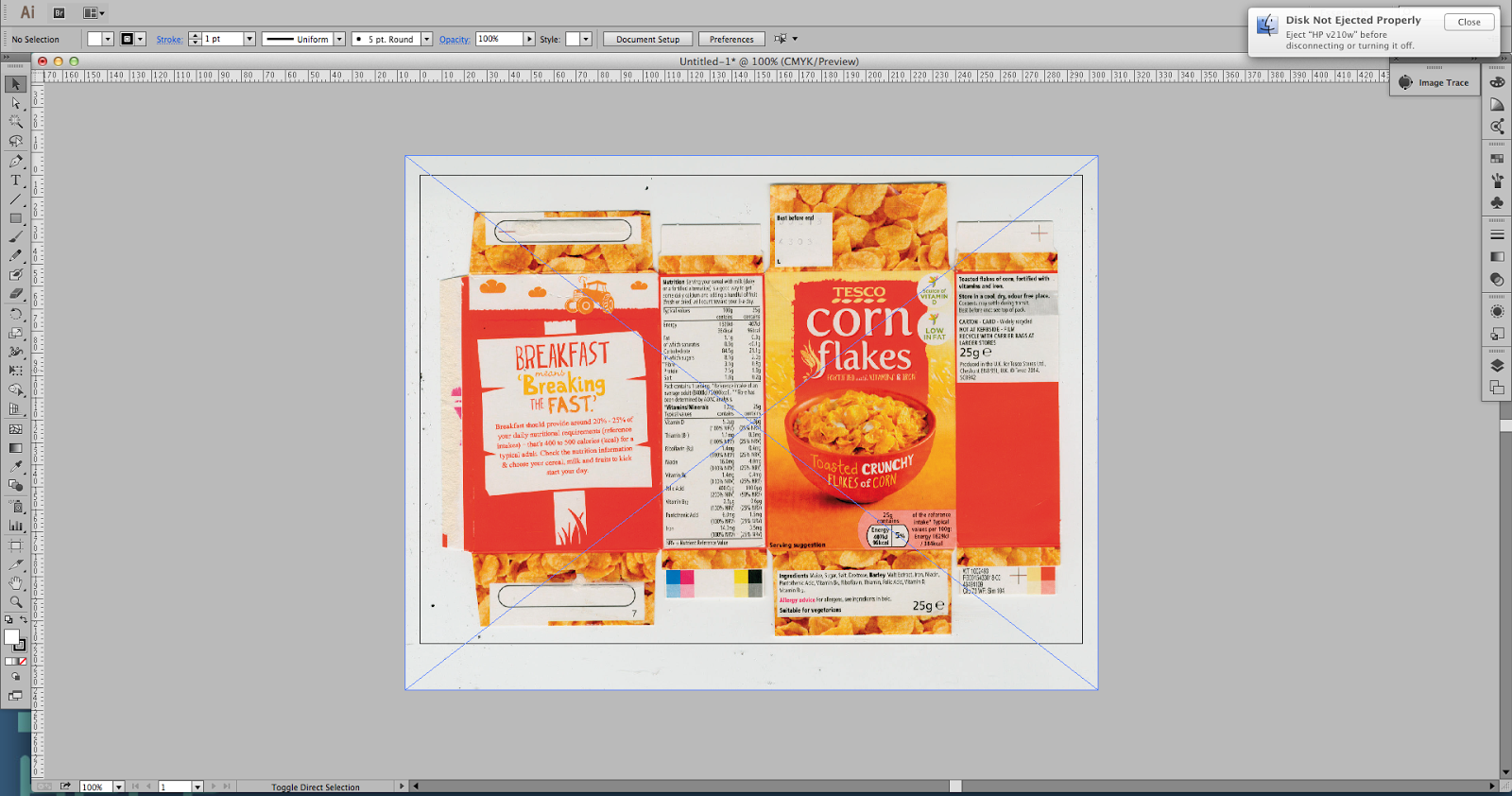
We started off by creating a net, using an image of a flattened net of a cereal box. Using Illustrator, we used the pen tool to draw the outline of the net to copy and place out characters onto it. This would help scale our design and lay out the entire final image appropriately. 

Firstly, we created the face of the box with just a square that we measured to be 71 mm (width) by 103 mm length. This could be used for the front and back of the packaging to create an even net. To line them up correctly and equally, we created grid lines by double clicking on the ruler that boards the screen and allocating them to the sides of the net faces. These squares, along with the outline, was created on a separate layer. The line was plain black and 2 points and the fill setting was blank to ensure it remained a clear line.


The next stage was designing our character. I chose a young audience of boys between the ages of 3 and 12, which is when they're old enough to eat cereal but not yet teenagers so will still be attracted by a fun, cartoon character that appeals to their imagination. I chose to design a cartoon viking as it would be easy to create a distinct, appealing theme. Horrible Histories is a book series for children and this inspired me to choose a historical figure.

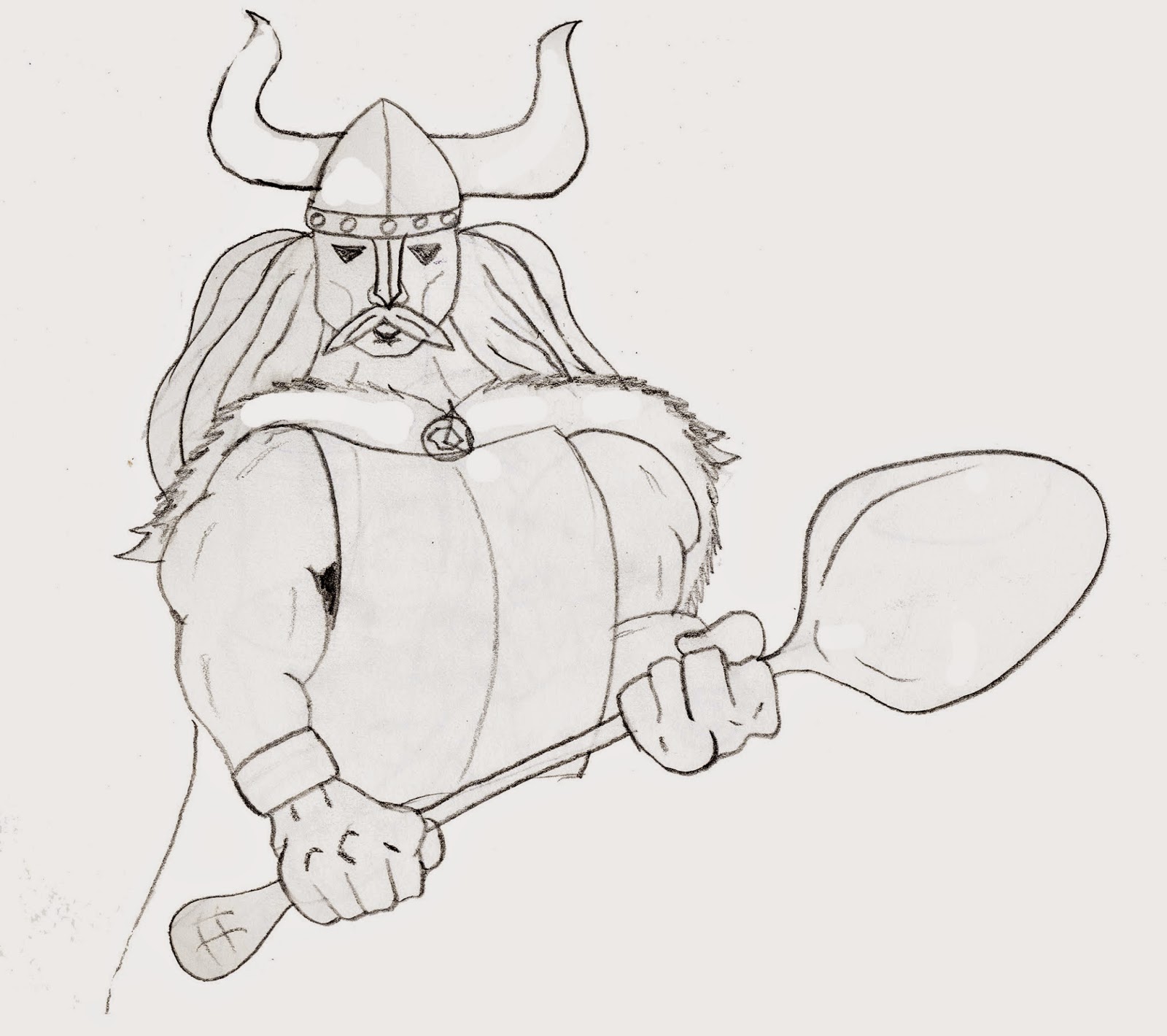
Here is the finalized, clean version of the sketch that I edited in photoshop to get rid of any imperfections that would interfere with the rendering in Illustrator. It's a viking holding a giant spoon in place of an axe with big, exaggerated cartoon hands and muscles.
Odin was the king of the Norse gods in Norse mythology. The font is "Badaboom" by dafont, which is a font commonly used in children's comics to express onomatopoeia. I think this fits in well with as it is an action theme with the warrior-viking character.
Using the pen tool, I outlined the sketch using the simple, 2 point black line. Additionally, using pointed brush strokes for shadows on the arms, spoon, face and neck create a more cartoon-ish look.I didn't want to create any obvious eyes that would stand out, as done incorrectly, it can look disturbing to young children, especially as this character is a Viking and already comes across as menacing, therefore the eyes are triangular shadows beneath his helmet.
The final rendering is the Viking stood over a bowl of cereal with a simple, duo tone orange background. I did this because the character is already quite detailed and I wanted a simple but un-used colour to bring out the detail.


Comments
Post a Comment